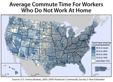
As part of the Census Bureau’s data collection activities from 2005-2009, a number of interesting charts have been published at http://census.gov.
The data should not be confused with Census 2010 — a separate survey conducted every 10 years. This is the first-ever, 5-year American Community Survey. Based on data from 3 million households, it details social, economic, housing, and demographic data “for every community in the nation“.
Among the surveys:
- Median Household Income, Inflation-Adjusted To 2009 Dollars (Chart)
- Median Housing Value Of Owner-Occupied Housing Units (Chart)
- Percent Of Households That Are Married, With Children Under 18 (Chart)
The ACS survey also charts average commute time by county. The chart is shown at top.
Whether you live in a “long commute” town like Richmond, NY (40 minutes), or a “short commute” town like King, TX (3.4 minutes), rising gas prices have made commute times and distances relevant to everyone.
Since the start of 2011, the average price for gasoline is higher by 54 cents per gallon. Assuming 22 miles per gallon on a passenger car, that’s an increase of 2.5 cents of gasoline per mile driven in the last 90 days. It’s a cost that adds up quickly, and can affect a household budget. Plan for higher pump prices moving forward, too. Historically, gas prices surge between April and June.
The American Community Survey is loaded with charts and data. It can tell you a lot about your current neighborhood, and any neighborhood to which you may want to relocate. Then, to bridge the ACS data with community details such as school performance and typical home prices, talk to a real estate professional.

Leave a Reply